SōBidō
- EN
- JP
Gazing at the world of Taisho Roman through a hedge of roses
バラの生け垣越しに眺める
大正ロマンの世界
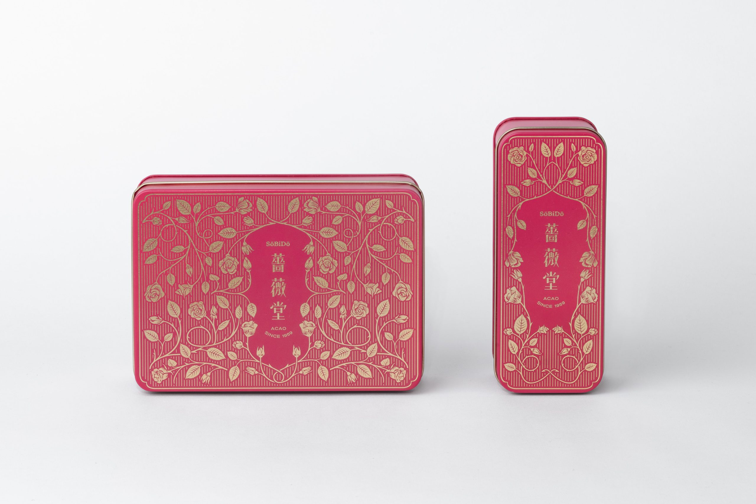
SōBidō (meaning "temple of roses") is a new bakery in Atami that specialises in selling baked goods made with edible roses. It is the latest venture by Tysons & Company, one of the leading restaurateurs in Tokyo behind venues such as breadworks, Ivy Place and Cicada.
With the target audience firmly set among the image-conscious Gen Z, the brief was to create branding with a distinct vintage feel; an aesthetic that hails back to a time before craftsmanship was overtaken by mass production. The mastery of craft with SoBiDo lies in their ingenious use of rose-infused flavours with their pastries, donuts and frozen desserts.
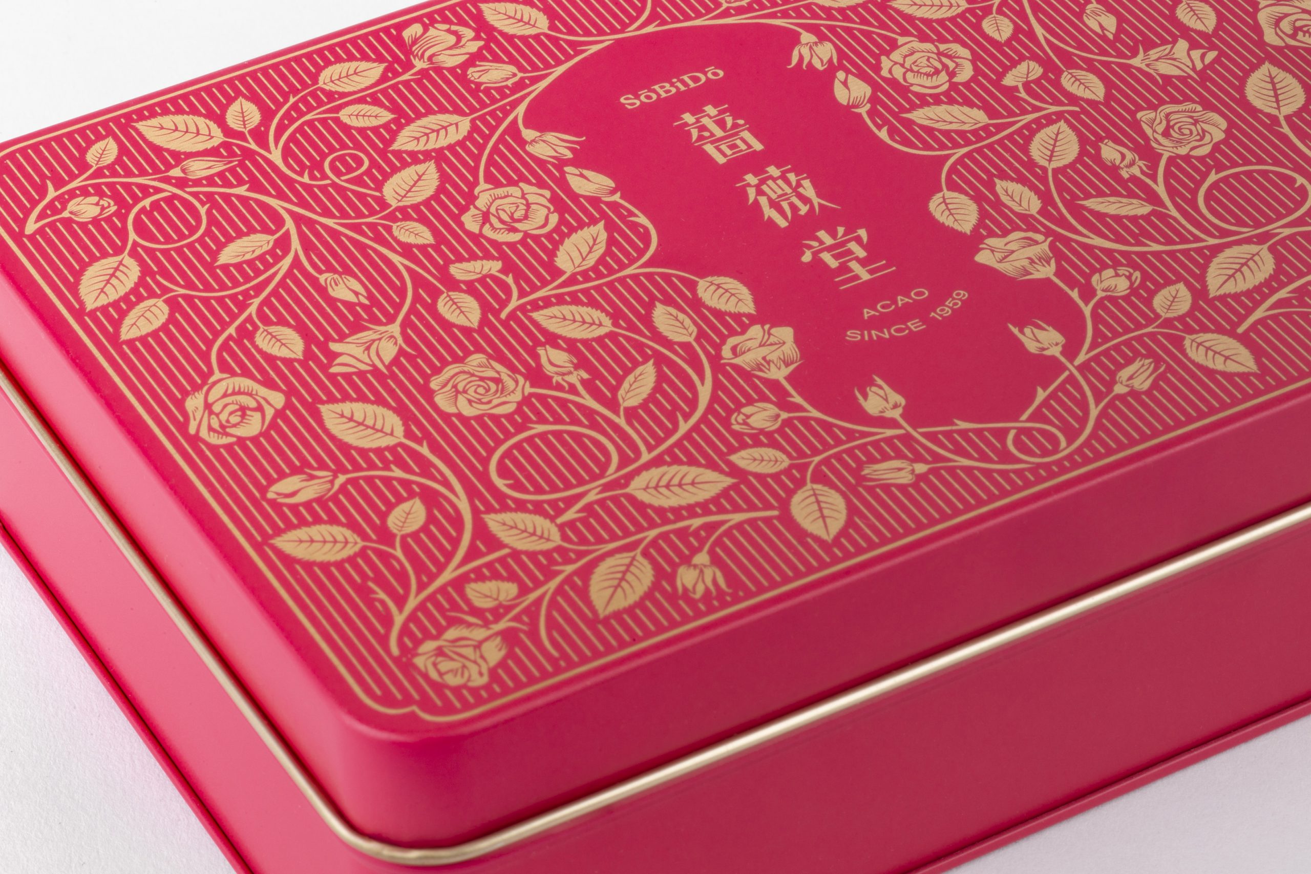
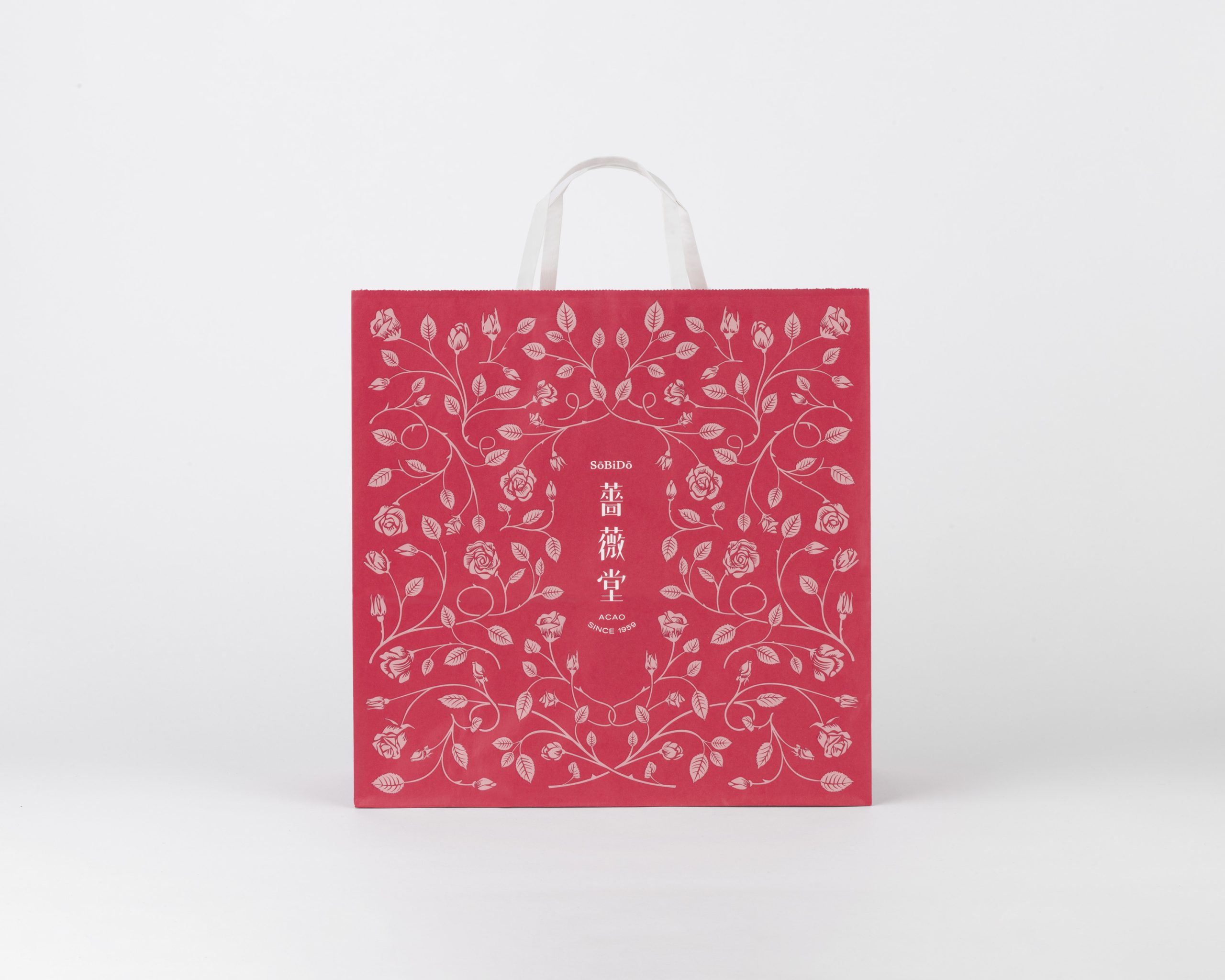
With the aim of communicating SoBiDo’s dedication in using this unique ingredient, we created a rose-tinted world embellished with an intricate hand-drawn pattern of rose bushes, that is scalable across a wide range of products. Taking cues from the Art Deco-inspired Taisho Roman, symmetry is used across variations of the pattern. The logo is also hand-drawn in the traditional kanji characters, and set in a vertical orientation to reinforce the nostalgia associated with the brand.
バラの寺を意味する「薔薇堂(そうびどう)」は、熱海に新規オープンした食用バラを使った焼き菓子やパンを販売するベーカリー。「breadworks(ブレッドワークス)」や「Ivy Place(アイヴィープレイス)」、「Cicada(シカダ)」など、都内有数のレストランを運営する「Tysons & Company(タイソンズアンドカンパニー)」が新たに手掛けた。
ターゲットをイメージ重視のZ世代に絞り、大量生産時代以前の職人技の美しさを表す、ヴィンテージ感のあるブランディングが求められた。バラを使った独創的なフレーバーのペストリーやドーナツ、フローズンデザートなどの商品には、薔薇堂のクラフトマンシップが表れている。
バラというユニークな素材を使った薔薇堂のこだわりを伝えるため、手描きのバラ模様を使ったデザインを作成し、さまざまな商品に展開できるようにした。アールデコ調の大正ロマンからヒントを得て、模様はシンメトリーに。漢字のロゴも手描きし、縦長にすることでノスタルジックなブランドイメージを表現した。